When I first saw the new Pantone Color of the Year for 2021, I will freely admit that I was disappointed. Dull Grey? Vibrant Yellow? Together? In this economy??!?
I didn’t get it.
But after digging into the release, reading the report, and actually slowing down to focus on the why it really does make a lot of sense. So today, I’m going to share my thoughts on their choice, show you how to use it for your home, and tell you where to go to add some vibrant yellow to your life.
Table of contents
Why do colors of the year matter?
I’ve been on the inside of one of the groups that make annual color forecasts. It’s made up of a large group of designers from all different industries and disciplines. They bring the actual colors they’ve chosen for the next year of their products and present them to the group. It was a privilege to have been selected to share my designs with them.
However, the important part of the presentation is the WHY. What drew them to that color, and what conversations were they having internally about it? What data points gave them confidence that this was the right choice for them? Does the color sell? How do the buyers resonate with it?
The color is not a guess. These are people who are letting themselves be affected by the cultural movement 1, 2, or 3 years before the rest of the people start thinking about it. Because of this, it’s not magic – it’s observation. It’s anthropology.
The gathering is an intense 3 or 4 days of conversations on the state of the entire globe’s culture. It’s wonderfully overwhelming. And at the end of it, you have a much clearer picture of where people’s heads are.
So it’s no coincidence that every company starts to sell the same colors at the same time. This is because humans are humans everywhere. We react to color in the same way, no matter who we are. And because colors create emotion. Using the right color for what you feel (or want to feel) can make all the difference in your happiness.
And this year, particularly when so much is hazy, and we are grasping for hope and a glimmer of happiness, these colors make so much sense.
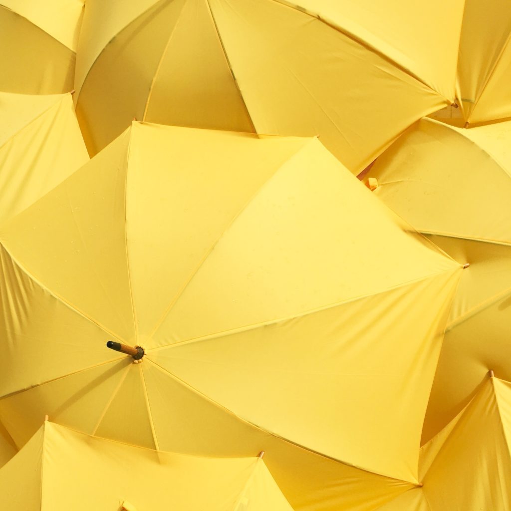
Pantone’s Vibrant Yellow
Again, I’ll admit that I do not fully understand the choice to release the grey. Especially now, we are on the cusp of color palettes starting to move warmer, browner. Clients are actually asking me for NOT GREY, lately. But the yellow, it makes sense.
From the Pantone release:

PANTONE 17-5104 Ultimate Gray + PANTONE 13-0647 Illuminating, two independent colors that highlight how different elements come together to support one another, best express the mood for Pantone Color of the Year 2021. Practical and rock-solid but at the same time warming and optimistic, the union of PANTONE 17-5104 Ultimate Gray + PANTONE 13-0647 Illuminating is one of strength and positivity. It is a story of color that encapsulates deeper feelings of thoughtfulness with the promise of something sunny and friendly.
A message of happiness supported by fortitude, the combination of PANTONE 17-5104 Ultimate Gray + PANTONE 13-0647 Illuminating is aspirational and gives us hope. We need to feel that everything is going to get brighter – this is essential to the human spirit.
Which, I mean, yes, right?
Vibrant Yellow Curb Appeal
A vibrant yellow such as this one can be rather intimidating when you first look at it. It is BRIGHT. It is BOLD. And it could easily overwhelm.
Which means, I am not recommending you go out and paint your entire house a vibrant yellow color. I mean, you could, of course, you do you, and it is your home. But that’s a move I would have trouble pursuing with you.
As I said, this color is BRIGHT. So my best tip for your exterior is to ground whatever you choose to accent by surrounding it with neutral colors, which fits right into the why of Pantone’s thinking. Grounded yet vibrant.


These images show how this yellow compliments a cooler grey with touches of black or a warmer tan with white accents.
A color this bright is easier to manage when you use it sparingly as an accent. Maybe that’s your front door, or shutters, or pillows on your chairs. Maybe it’s a kicky porch light or even some perennial plantings. All I’m saying is go easy, and it’ll be much more satisfying. A little surprise, instead of a huge statement…
Ideas for Vibrant Yellow Curb Appeal

Sources for Vibrant Yellow Curb Appeal:




exterior light – rejuvenation
modern entry door – home depot
house numbers – dropcap studio
outdoor side table – room and board
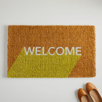
welcome mat – west elm
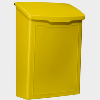
metal mailbox – home depot
yellow lantana – monrovia
yellow yucca – monrovia
acapulco chair – silla acapulco
Vibrant Yellow Paint Colors
This color can be a lot to handle. And also, getting a vibrant, saturated yellow in a formula that can also stand up to the environment can be challenging to find. I’ve got six favorite vibrant yellow paint colors that are also rated for exteriors, which I’ve shared below.
Again, these are bright, bold colors! When it comes to exterior finishes for these colors, I will lean as glossy as you can get them to give them some depth. (Inside, I’d go with a velvety eggshell finish.) It’s like painting with pure sunshine!
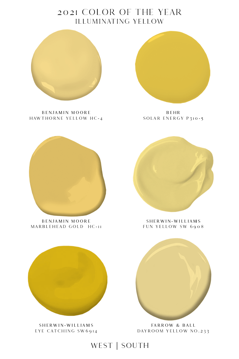
hawthorne yellow HC-4 by benjamin moore
solar energy p310-5 by behr
marblehead gold hc-11 by benjamin moore
fun yellow sw 6908 by sherwin-williams
eye catching sw 6914 by sherwin-williams
dayroom yellow no.233 by farrow & ball
I truly hope this helped you bring a little sunshine into your life as we move into the new year. If you ever need help figuring out just how to accent your home with a new color, please let me know how I can help!
RELATED POSTS
As Founder and Principal Designer of West | South, Mel is known for creating exterior color and materials plans that elevate homes across North America. Blending practical know‑how with a warm, personal approach, she helps homeowners update older houses or shape brand‑new builds with balanced, beautiful combinations that last. With clear guidance and a friendly touch, Mel makes exterior design easy to understand and enjoyable from start to finish.
