


Happy New Year, friends!
I decided to start off the year talking about the annual Pantone Color of the Year – Classic Blue.
It’s one of my personal favorite colors because it’s so versatile while still being so timeless.
From the Pantone release: “Instilling calm, confidence, and connection, this enduring blue hue highlights our desire for a dependable and stable foundation on which to build as we cross the threshold into a new era.”
Leatrice Eiseman, the Executive Director of the Pantone Color Institute, goes on to say: “…Classic Blue encourages us to look beyond the obvious to expand our thinking; challenging us to think more deeply, increase our perspective and open the flow of communication.”
Whooooo I do love some goooood color communication copy! You can read more about how these colors are chosen here, where I talk about the years I was involved in the annual color selection for Color Marketing Group.
So let’s take a look at some ways you can add a dose of calm, confident connection to your paint, interior or wedding planning.
Table of contents
Classic Blue Paint Colors
More than one paint company picked a classic blue as their own Color of the Year, Sherwin-Williams’ choice of ‘Naval’ being a particularly strong selection. Here’s some inspiration to get us started:
This color as paint can be a little tricky. It’s pretty susceptible to light conditions, which is one of the reasons it’s filled with such depth. However, this can make it hard to get just the color you want. Even more important than usual, SWATCH SWATCH SWATCH! Don’t trust your computer screen or even the paint chip. Paint actual paint on a piece of poster board or right on the surface you are changing. Be sure before you by the full gallon!
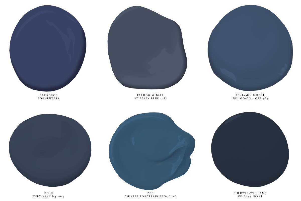
01 top left: Formentera by Backdrop
02 – top center: Stiffkey Blue No. 281 by Farrow & Ball; NOTE: F&B’s archival color Drawing Room Blue is really a better match to Pantone’s Classic Blue, but unfortunately F&B’s archive colors cannot be sampled – however, if you’re up for the $$$ risk, it’s a truly phenomenal blue
03 – top right: Indi Go-Go CSP-565 by Benjamin Moore
04 – bottom left: Very Navy M500-7 by Behr
05 – bottom center: Chinese Porcelain PPG1160-6, PPG’s 2020 Color of the Year
06 – bottom right: SW6244 Naval, Sherwin-Williams’ 2020 Color of the Year
You’ll also notice there is a quite bit of a swing in tone between each of these colors. That’s because much like the sky or the ocean, blue shifts depending on the brightness and color of the light. There’s a blue for every situation – you just have to be willing to try a couple before you choose.
And if you EVER need help figuring it all out, just give me a holler! I’m here to help!

RELATED POSTS
this post may contain affiliate links, and As an Amazon Associate I earn from qualifying purchases. which means that the company might give me a few pennies if you purchase with my link. Thanks for your support!


")


